See it in action
What Markpad actually looks like
Every window below is the real extension, captured from the current build.
Why Markpad exists, the design decisions behind it, and what it is built with.
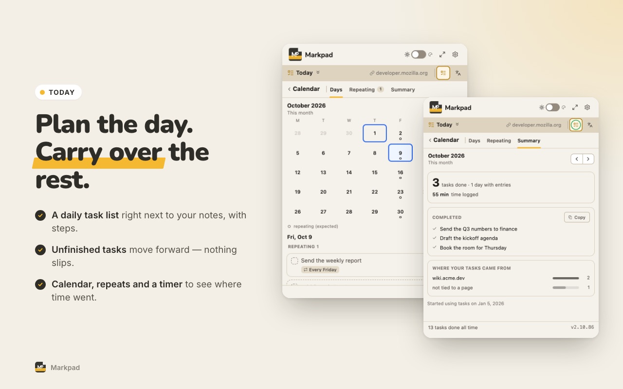
Markpad started with three everyday frustrations. Each tab exists to solve one of them — and it all works offline, with no account required. A daily task list (Today) and in-context translation came later, for the same reason.
Problem
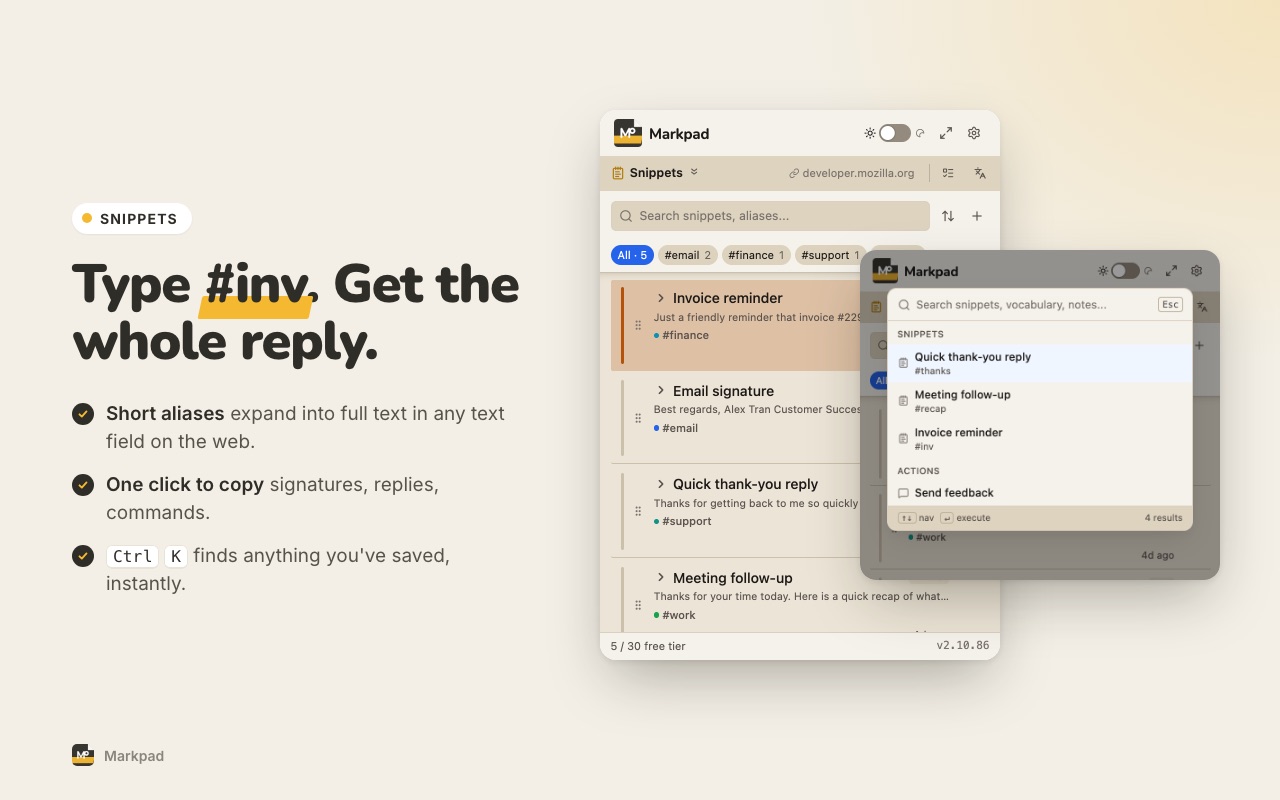
Developer Alex retypes the same review comment dozens of times a week. A full note app is too heavy for a quick paste, and a dedicated text expander is one more subscription.
Solution
Save it once with a short alias. In any text box, type #alias and press Ctrl+Shift+K — the full text appears.
Problem
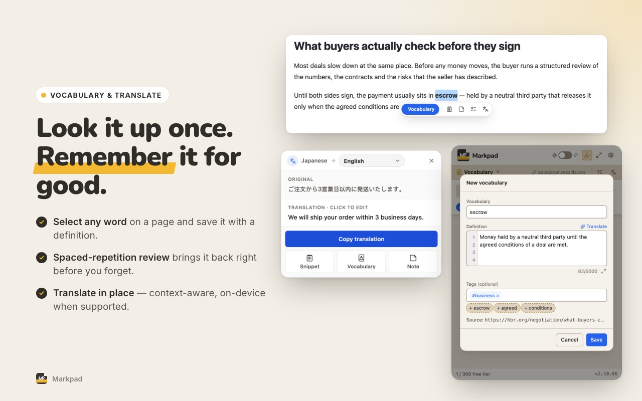
Researcher Bình runs into "LoRA" for the fourth time and still can't recall the definition. A dictionary lookup is gone the moment the tab closes; a flashcard app is overkill for saving one term.
Solution
Select the word → right-click → Add to Vocabulary. Your own definition, saved — and brought back for review before you forget it.
Problem
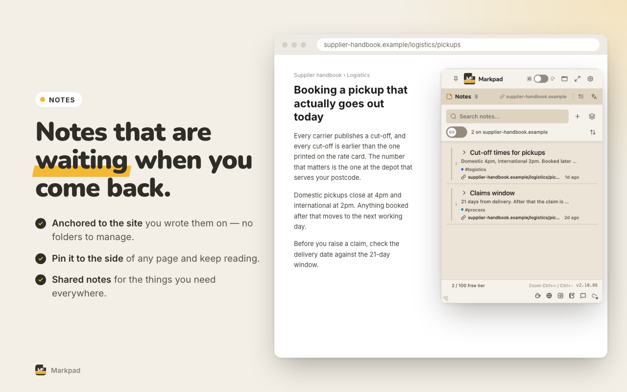
PM Chi researches 20 competitor sites. Two weeks later, she's forgotten the insight she had. Bookmarks only save the URL — not the thought.
Solution
Notes are pinned to the site itself. Revisit the page and the note is right there — you save the insight, not just the link.
Every window below is the real extension, captured from the current build.
Warm paper background, near-black text (never pure black), quiet borders. Blue marks what you can act on — selection and focus; the brand yellow is kept for the logo and highlights. Light and dark follow the same palette.
Chrome — nav, tabs, borders — recedes; content comes forward. Hierarchy is built with size and weight, never color.
Rounded corners and multi-layer soft shadows instead of one hard drop-shadow — cards and toasts feel gently lifted, never harsh.
Motion only where it explains something, and never in the way of typing. A tool you open fifty times a day should feel instant, not decorative.
Chosen in the first week and never revisited — one less decision to make on every release.
Markpad is made by thanhtrung.ep, an independent developer, under T-ep Studio. Questions or feedback? support@t-epstudio.com